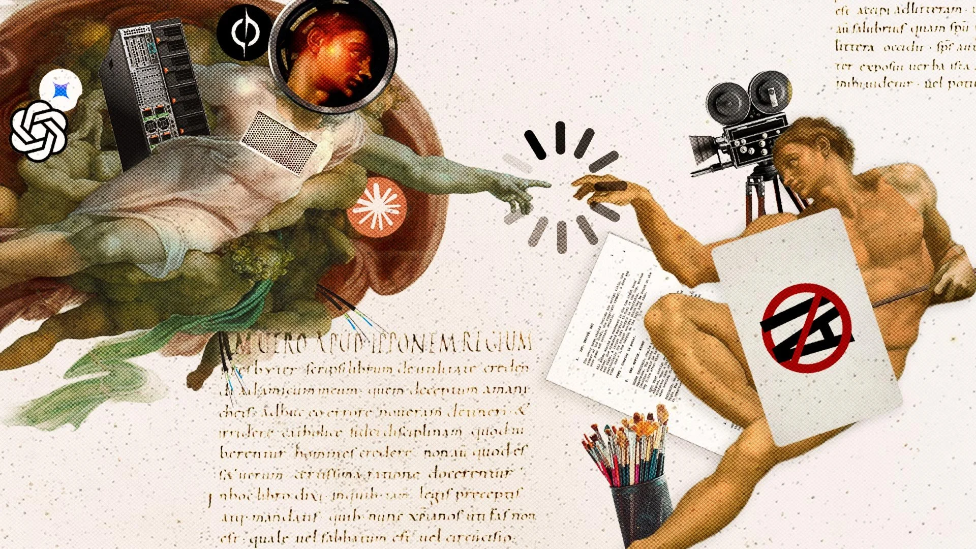
We designed the editorial for AI in Media: The Great Disruption, giving each chapter its own story-driven visual so readers could grasp the idea before reading and set the mood.
Scope of work
Editorial Design
Creative Direction
Visual Concept Development
Client
Fiction LA
How do you design a book about a media landscape in constant change?
AI in Media moves across a century of persuasion, mass media, digital disruption and AI, from Edward Bernays and three-network television through Napster, the Hollywood strikes, Cambridge Analytica, data centers, Apple and Patagonia.
The challenge was to make those shifts feel connected without flattening them into the same visual treatment. The book repeatedly returns to a larger idea: the tools keep changing, but the need to understand audiences, build trust, and make clear choices does not.
The goal wasn’t to decorate every chapter, rather it was to translate the book’s three larger arcs, and the individual chapters within them, into strong visual ideas that could help carry the argument.
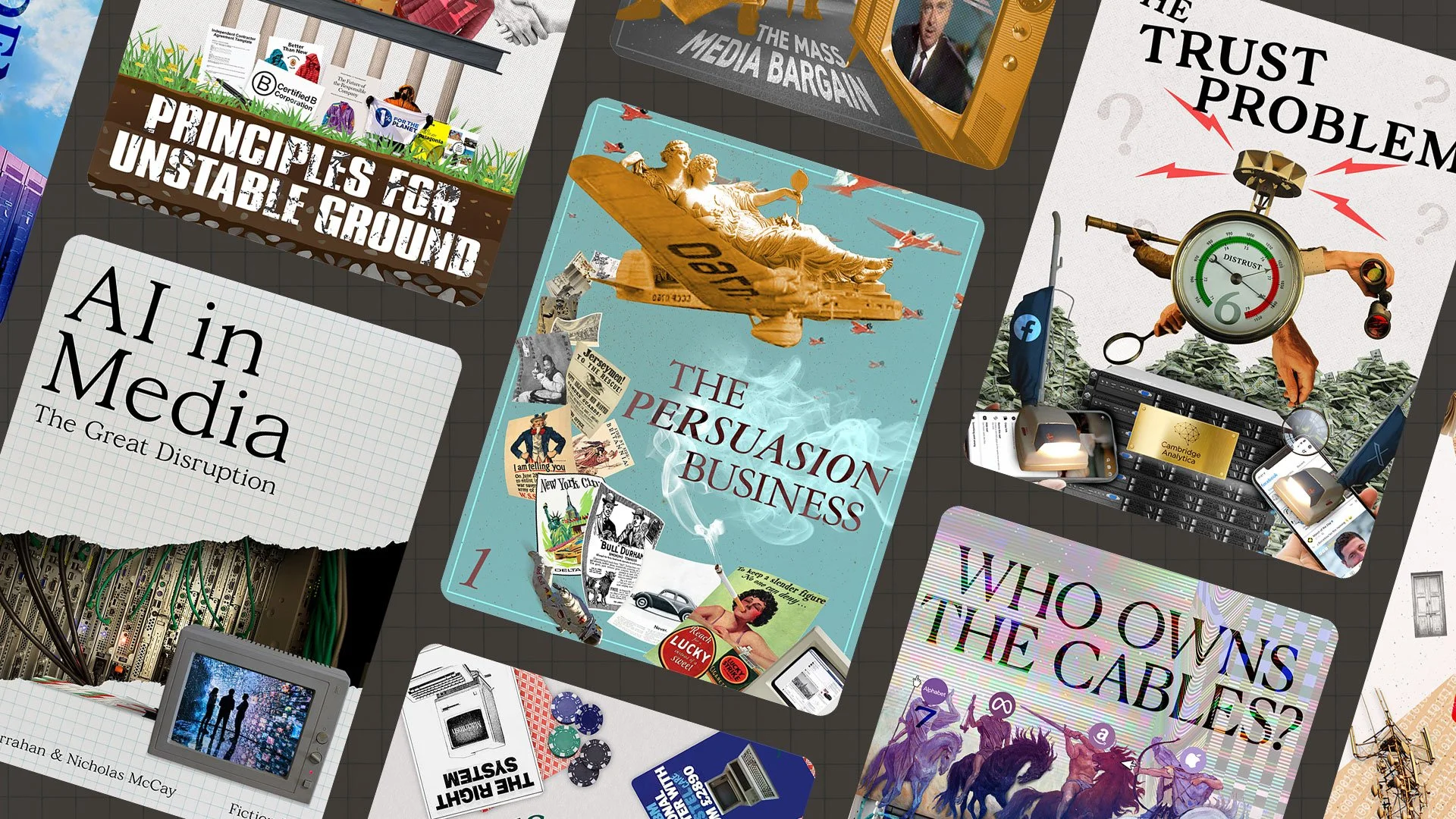
Illustrate the tension while weaving a story
Rather than show what each chapter mentions, I looked for the conflict underneath it and gave that a visual language. To highlight a few of the chapters:
The Flood is about saturation, where content becomes abundant and meaning becomes scarce.
The Trust Problem explores manipulation, authenticity and declining confidence in what audiences see online.
The Persuasion Business looks back at the long history of influence and the idea that the tools change faster than human psychology does.
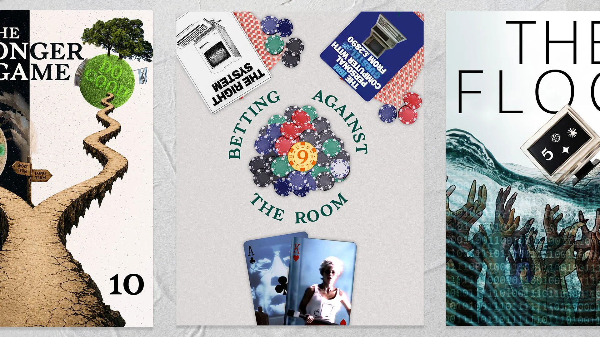
What does it look like to bet against the room?
Chapter 9 tells the story of Apple’s “1984.” Apple’s board reacted badly enough that the company instructed the agency to sell back the Super Bowl airtime. The commercial ran anyway and became one of the most famous ads in advertising history.
I didn’t want to recreate the commercial. The more interesting subject was conviction: what it feels like to place a bet when consensus points the other way.
So the chapter became a poker table. The cards reference the kind of machine-first computer advertising Apple was pushing against. The chips turn conviction into literal stakes. In the pot sits one oversized 9, pulled from the chapter number.
It also became one of the clearest expressions of the book’s larger argument. As tools get faster and systems get better at producing safe, competent options, the harder part is still knowing when to trust an idea that doesn’t fit the pattern. Chapter 9 frames that tension directly, contrasting optimization and consensus with the conviction to back something less obvious.
That’s what the visual was meant to carry: not simply the story of one famous ad, but a broader question running through the book…
“When the tools can generate more options than ever, what is actually worth betting on?”
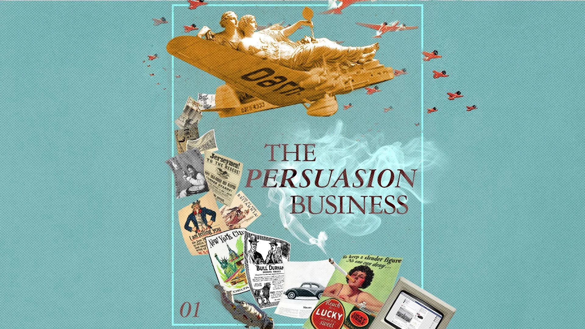
One system, many stories
Each chapter was allowed its own visual personality. Consistent themes were included as well, such as color, chapter numbers, page structure and image treatment, keeping eleven very different arguments reading as one publication.
CarmelloVision is a Tokyo-based digital partner for companies expanding between Japan and global markets. Founder Shane Allen combines cross-cultural UX strategy, design execution, and over a decade of experience working inside Japanese and global teams to help brands navigate unfamiliar markets and build meaningful connections across cultures.