By Shane Allen | CarmelloVision
Every eCommerce team obsesses over the same two numbers: what it costs to acquire a customer, and how many visitors convert. Entire industries exist to move those metrics.
Almost nobody designs for the third number — the one that quietly eats the other two.
Returns.
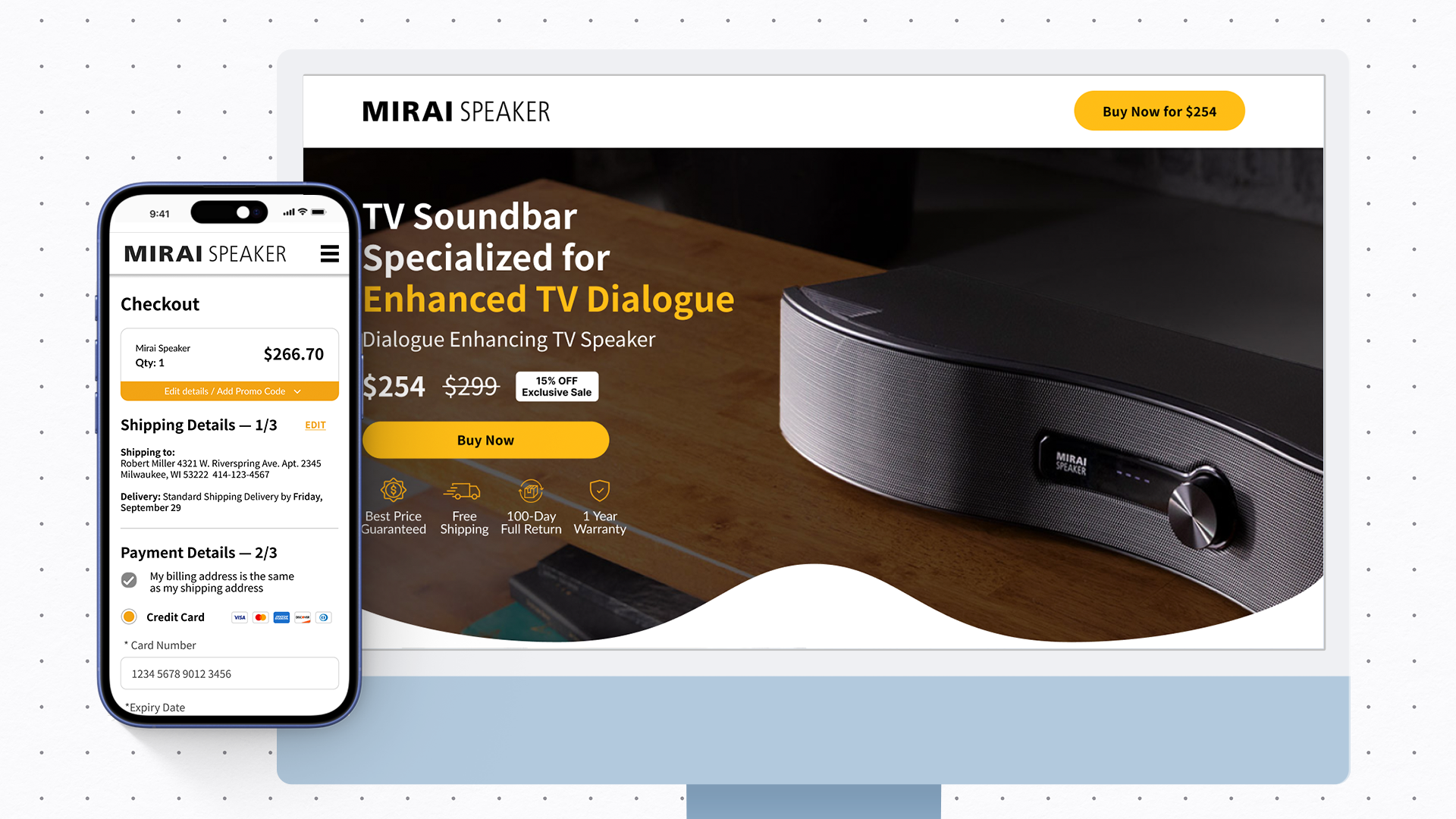
I spent two years as the design and strategy lead on Mirai Speaker's U.S. market entry — a Japanese audio brand which originally had 200,000 units sold at home and zero presence in America. New category, skeptical audience, two platforms to build from scratch. We did the usual work: landing page optimization, A/B testing, creative iteration. Acquisition costs came down 70%. Amazon conversion nearly tripled.
But the lesson that stuck with me most wasn't about getting people to buy.
It was about what happened after they did… And how to improve satisfaction.
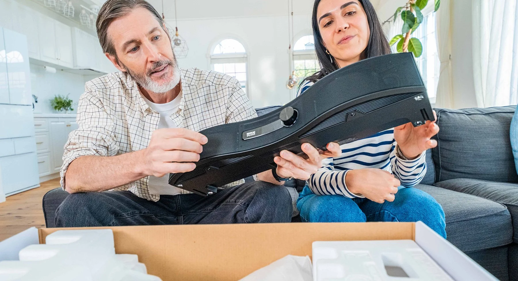
Opening the box to clearer audio. Photo: Mirai Speaker.
The return that isn't about the product
Our buyer was an older adult struggling to hear TV dialogue — or their adult child, buying on their behalf. This audience reads reviews carefully, calls customer service, and returns products the moment something feels off.
Early on, returns were coming in at a rate that could have quietly killed the U.S. expansion. The instinctive read was product-market fit: maybe the product doesn't work for American TVs, American living rooms, American ears.
The data told a different story. The team didn't just track the return rate — every return was categorized by reason, and customers were invited to structured exit interviews: why they returned it, what they compared it to, how their TV was set up. When we actually looked at the breakdown, a significant share weren't product failures at all. They were connection failures. The speaker worked fine — the customer just couldn't figure out how to hook it up to their specific TV, gave up, and sent it back.
That's not a product problem. That's a design problem. And design problems are fixable.
What we built instead of accepting it
We treated post-purchase confusion with the same seriousness most teams reserve for pre-purchase conversion:
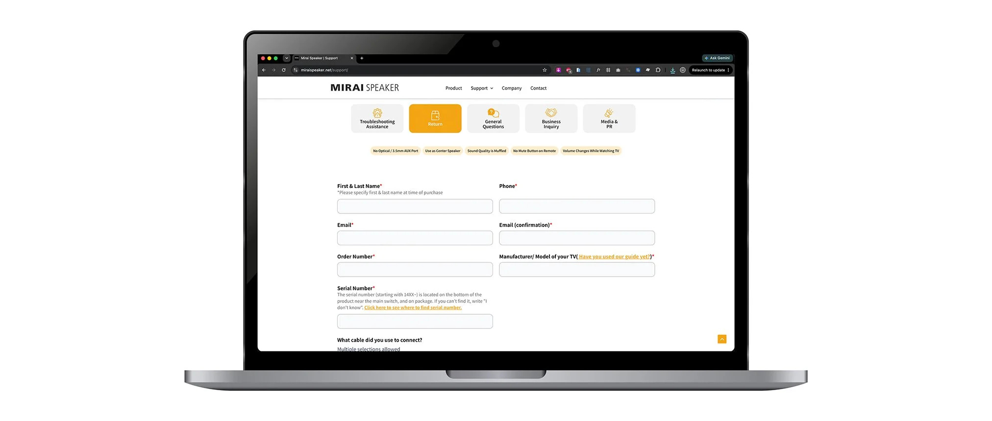
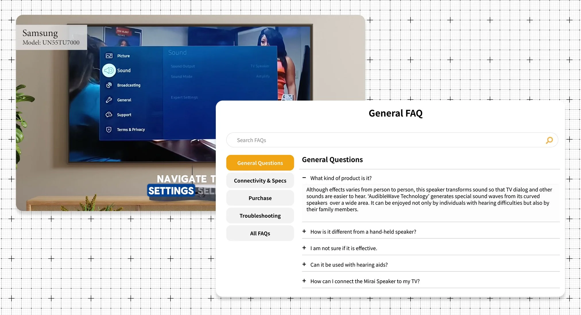
A dedicated Connection page. Not a generic manual — a visual, TV-specific guide on the support site, because "how do I plug this in" has a different answer for a 2015 Samsung than a 2023 LG.
A searchable help center and FAQ system built around the actual questions coming into customer service, not the questions we imagined customers might have.
Setup video content produced for the support page, the Amazon listing, and YouTube — meeting the customer wherever they went looking for help.
Support content positioned before the point of frustration — woven into post-purchase emails and packaging inserts, so the answer arrived before the customer hit the wall.
A year after the Connection page launched, the team's own return-reason analysis noted something that made the whole effort worth it: connection issues had all but disappeared from the breakdown.
How are you decreasing your return rate?
The part nobody tells you about
Here's what surprised me most: fixing the confusion-driven returns didn't just lower the return rate. It cleaned the data.
Once the fixable returns were gone, what remained were the real ones — customers for whom the product genuinely wasn't the right fit. That sign, no longer buried under setup frustration, became some of the most valuable market feedback the company collected. It ultimately informed the decision to pause U.S. sales and fold those learnings into the next generation of the product.
Good returns work doesn't just save margin. It tells you the truth about your product.
The reframe
Here's the thing I'd tell any team launching a physical product online:
A return is a conversion in reverse — and it deserves the same design attention.
You already accept that unclear messaging kills conversions. The same logic runs downstream: unclear onboarding kills retention of the sale itself. Every confused customer is a refund, a shipping cost, a dented review score, and a lost repeat buyer — all for the price of a missing setup guide.
The economics compound quietly. Cutting acquisition cost gets celebrated in every weekly meeting. Cutting confusion-driven returns rarely gets measured at all — even though a prevented return is worth more than a new sale, because you've already paid to acquire that customer.
Three questions worth asking about your own product
-
The rate tells you there's a leak. The reasons tell you whether it's the product or the experience around it. If you're not categorizing every return — and talking to the customers behind them — you're guessing.
-
If the answer is "at checkout," your return rate is partly a decision you made.
-
For us, that window decided whether the product stayed or shipped back.
The full Mirai Speaker case study, including how we approached the brand site, Amazon storefront, and content systems, can be found here: carmellovision.com/work/mirai-speaker-website
CarmelloVision is a Tokyo-based design and strategy studio led by Shane Allen, a UX/UI designer and cross-cultural brand strategist with over 10 years of experience working inside Japanese and global teams. Having worked with clients across Japan, the United States, APAC, and the Middle East, CarmelloVision helps companies connect with new audiences through thoughtful UX, localization, and digital storytelling. If you're expanding into new markets or need digital positioning that actually crosses cultures, let's talk.
Check out these project case studies!